Get Started
To use dash_trich_components install the package on your project's terminal.
Installation
pip install dash-trich-components
Configuration
Import dash_trich_components on the file that you wnat to use it.
Components
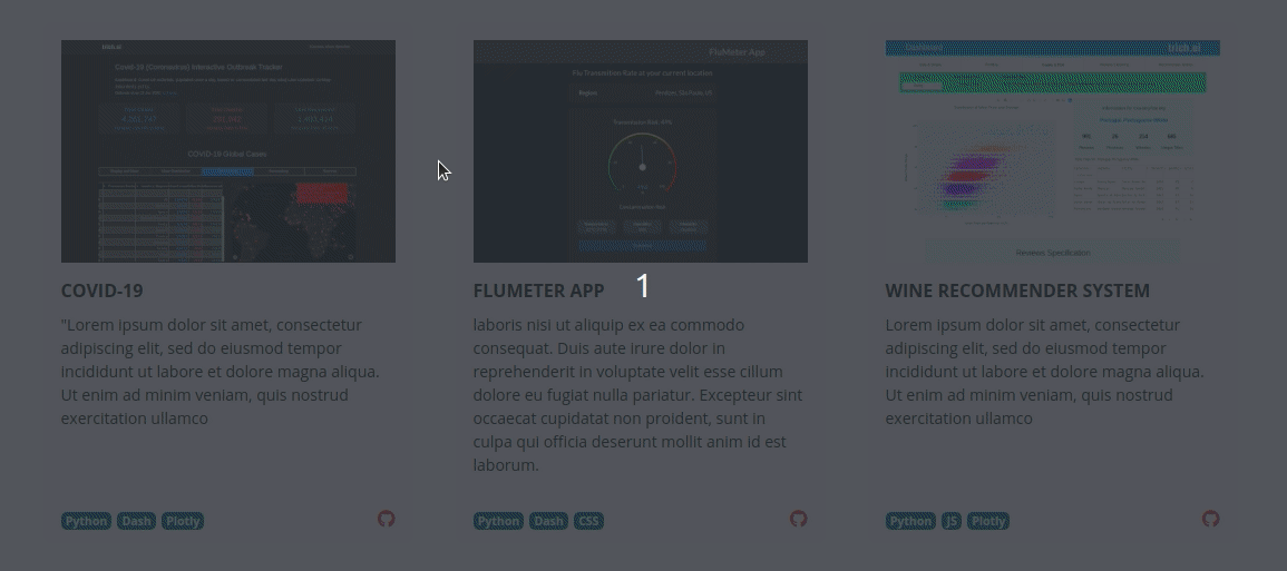
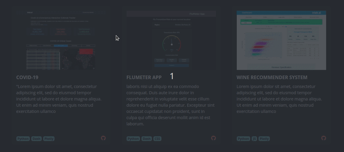
Card
A simple card with an image, title, description, badges and link for github with icon, all this arguments are optional.
| Argument | Value | Default |
|---|---|---|
| id | (string, optional): id of the element | Null |
| link | (string, optional): link to redirect when the user clicks on the image | Null |
| openNewTab | (boolean, optional): defines if card link will open on a new tab or the same tab | True |
| image | (string, optional): image that will display on card | Null |
| title | (string, optional): title of the card | Null |
| description | (string, optional): description of the card | 'Null |
| badges | (list, optional): list of strings to display in badges, to work porperly put up to 4 or 5 | Null |
| git | (string, optional): github URL, is not required, only if you want to | Null |
| dark | (boolean, optional): theme color of the card, that for default is light | False |
| className | (string, optional): used with CSS to style elements with common properties | Null |
| style | (dict, optional): defines CSS styles which will override styles previously set | Null |
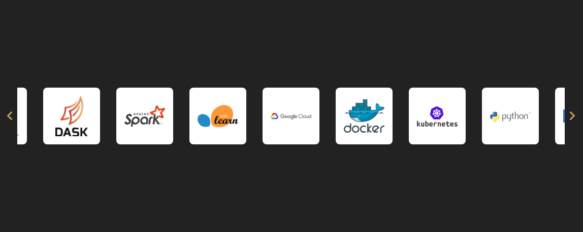
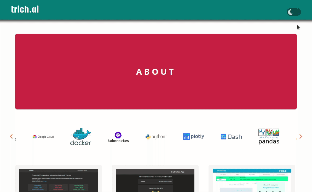
Carousel
A simple carousel for your Dash projects! Add a list of HTML elements inside the component and it turns to carousel slides.
| Argument | Value | Default |
|---|---|---|
| id | (string, optional): id of the element | Null |
| dots | (boolean, optional): show dot indicators | False |
| arrows | (boolean, optional): show prev/next arrows | True |
| infinite | (boolean, optional): infinitely wrap around contents | True |
| autoplay | (boolean, optional): enables autoplay | False |
| speed | (number, optional): infinitely wrap around contents | 1000 |
| slides_to_show | (number, optional): number of slides to show | 3 |
| slides_to_scroll | (number, optional): number of slides to scroll | 1 |
| center_mode | (boolean, optional): enables centered view with partial prev/next slides | False |
| center_padding | (string, optional): side padding when in center mode (px or %) | '50px' |
| swipe_to_slide | (boolean, optional): allow users to drag or swipe directly to a slide irrespective of slides_to_scroll | True |
| variable_width | (boolean, optional): variable width slides | False |
| responsive | (list, optional): list of objects containing breakpoints and settings (see example) | Null |
| vertical | (boolean, optional): vertical slide mode | False |
| className | (string, optional): used with CSS to style elements with common properties | Null |
| style | (dict, optional): defines CSS styles which will override styles previously set | Null |
Resposive argument examples
Customize based on breakpoints, you have to pass a list of object, with your settings
! You have to use strings and camel case to pass the arguments (only on the responsive argument), like in the example bellow.
this component was built from: react slick
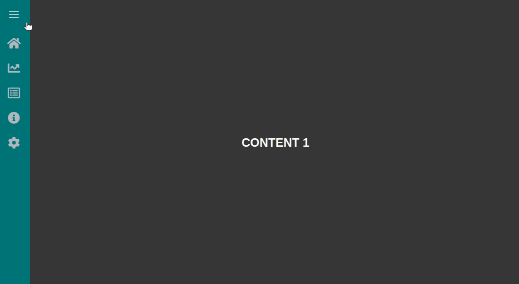
Side Bar
A collapsible side bar for your dashboard, with icons from Font Awesome.
! This component uses Font Awesome Free 5.8.1, you need yo use the icons available on Font Awesome Gallery and pass the class of the icon on "icon" argument, just like the example bellow.
! For using the callbacks like the example bellow, you will need to have installed Pandas library.
! To have this effect of the content being pushed by the side bar, it is necessary to use id="page_content" in the sidebar sibling Div, like the example bellow.
! For the sidebar height to be 100% relative to the page, the parent div has to be with the 'position': 'relative' attribute, as in the example
pip install pandas
SideBar
| Argument | Value | Default |
|---|---|---|
| id | (string, optional): id of the element | Null |
| bg_color | (string, optional): color of sidebar background | '#2B7279' |
| text_color | (string, optional): color of sidebar text | '#FFFFFF' |
| className | (string, optional): used with CSS to style elements with common properties | '' |
SideBarItem
| Argument | Value | Default |
|---|---|---|
| id | (string, optional): id of the element | Null |
| label | (string, optional): text of menu item on sidebar | 'Label' |
| icon | (string, optional): icon of menu item on sidebar, pass the icon class from font awesome | 'fas fa-circle' |
| className | (string, optional): used with CSS to style elements with common properties | '' |
this component was built from: react side nav
Theme Toggle
Dark/Light theme toggle switch for your Dash project.
Include the component in your project, and include the color settings in the CSS, following the example below. It's important to follow this step, otherwise the theme toggle component will not work.
It is also possible to customize the colors of the toggle switcher with arguments if you like.
Or, if you prefer, you can pass no arguments and use the default values.
CSS Settings (Important step, otherwise the component will not work)
Include this settings in your CSS with the colors you want for each theme.
First define the colors of your light theme, you can include as many colors as you want, adding more variables.
In the second part use the same variables to define the value they will receive when the dark theme will be active.
Now, you should use these color variables in all the color properties of your CSS, as in the example bellow.
Don't know how to add a CSS file in you project?
You just have to create a folder with the name "assets" at the root of your project, and inside create a
file with the extension .css, for example "styles.css".
To use this component it is recommended that you have a basic knowledge of CSS.
| Argument | Value | Default |
|---|---|---|
| id | (string, optional): id of the element | Null |
| className | (string, optional): used with CSS to style elements with common properties | Null |
| style | (dict, optional): defines CSS styles which will override styles previously set | Null |
| bg_color_dark | (string, optional): background color of toggle switch when dark theme | '#232323' |
| icon_color_dark | (string, optional): sun icon color of toggle switch when dark theme | '#EDC575' |
| bg_color_light | (string, optional): background color of toggle switch when light theme | '#07484E' |
| icon_color_light | (string, optional): moon icon color of toggle switch when dark theme | '#C8DBDC' |
| tooltip_text | (string, optional): text that will appear in tooltip (only desktop) | 'Toggle light/dark theme' |
Updating
Stay tuned and update our package to get new components released, bug fixes and improvements.
To uptade just run in your project's terminal the command bellow.
pip install --upgrade dash-trich-components
Authors
This library is developed by trich.ai team.